As the second project of my internship, I was tasked with examining the UI/UX of Cael Reporting and redesigning the cloud-based webapp. I worked collaboratively with a senior designer, senior developer, and PM. I owned the design project and received help from senior designer when he did a master review of my design near the end.
Improve the information architecture, navigation, and UI of Cael Report.
There are tons of information and attributes to sort through in a case. Cael Report allows users to organize different information into reports that then can be scheduled to be automatically sent to those who need it.
Cael Report has 3 main features:
- Dashboard that displays firm data and different levels of report urgency
- Report that lets users pick from different attributes of data and generates 3 types of charts into a report
- Scheduler that lets users pick send reports to send at scheduled time to those who need it
Research
Stakeholder InterviewsI interviewed 3 stakeholders and organized needs and priorities:
With a better undertanding of the needs and priorities, I conducted 5 usability tests that covered the usage of the 3 primary pages. Having the users go through this workflow allowed me to see how they interacted with most functions of this web app.

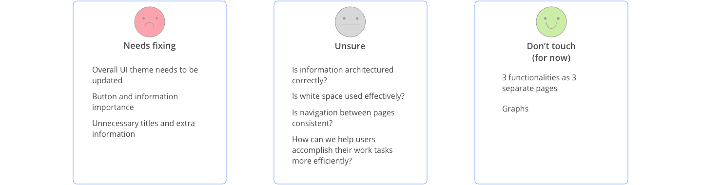
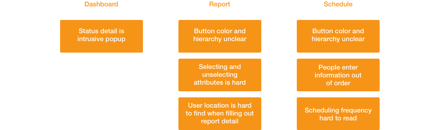
I synthesized the usability testing session findings and organized pain points by primary pages:
Ideate
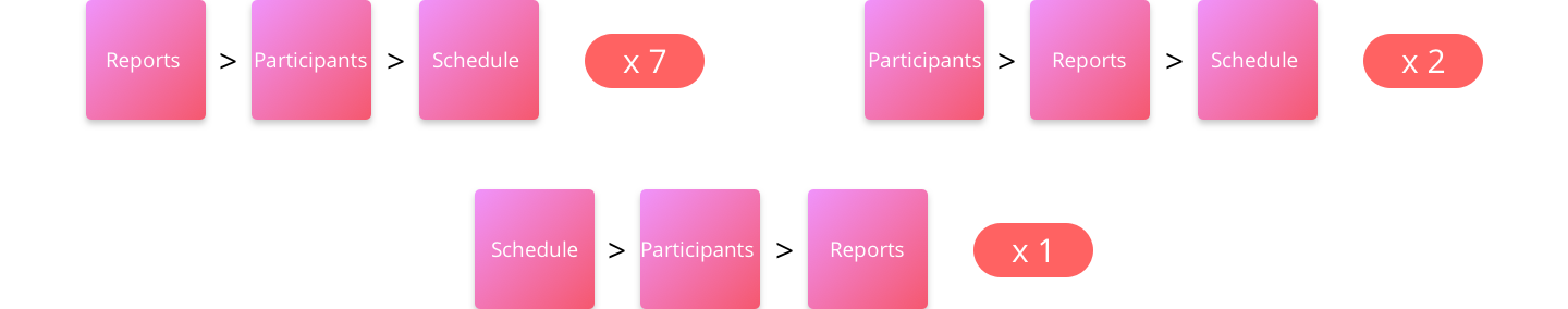
Re-information architectureI wanted to address the scheduler function first since many had to go out of order to fill in information. I observed many people going out of the current system order of first selecting who to send it to, what reports to send, then finally when to send it.

I conducted a open card sorting session and asked 10 participants to organize the 3 sections (report, participants, schedule) into the order that they would fill out in their workflow. The goal was to understand how the sections should be matched.
Design
Design DecisionsI validated these design decisions by sending out a survey to 50 users 10 product team members and explain what solutions the design addressed. Of all the selected results, it had a minimum of 73% (44/60) support.

Due to NDA, I cannot show the final screens. In the end I delivered and connected 30+ screens. I also designed the interactions and accounted for error states.